
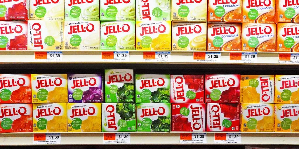
Many go through a make-over…new hair-do, wardrobe, losing weight. And the same happens in companies as noted how Jell-O is doing a logo makeover.
Jell-O’s owner, Kraft Heinz, it’s time for a logo makeover for the iconic brand. Kraft-Heinz the update will usher in a “new visual identity that positions the brand for relevance today and in the future among a new generation of parents” while still honoring “the brand’s legacy.”
Here’s the change: the new design embraces matte block letters shaded with white, with the ‘O’ angled slightly upwards.
In contrast, its retired look displays glossy, narrow lettering with an ‘O’ in a typeface resembling handwriting.
At the end of the day…one might have to ask: Will the Jell-O brand makeover make any difference?


